Lookout Refresh
Defining & applying a new cross platform product design language

Project overview
Project Brief
Lookout a cyber security company received a bold new brand identity. The new brand guideline was a big departure from the previous logo and identity. The guideline itself was focused primarily on advertisement and print applicaitons of the brand. I was tasked with bringing all our digital products inline with this new brand identity across mobile, web and desktop.
The Problem
There was minimal guidance on applying the brand to digital products. I was challenged to interpret the brand guide line document and then establish a refreshed product look and feel for Lookouts mobile client, web console, and desktop client that satisfied stakeholders.
Goal
Establish a refreshed product look across Lookout’s digital products. Define component libraries and usage guidelines to support designers and developers during implementation and future development cycles.
Responsibilities
Design Vision
Brand Guideline Interpretation
Design System
Phased Rollout Plan
Accessibility
Process
I started by working with the Marketing team to learn any challenges or insights with their experience using it the brand guideline so far.
Working with the design team to identify key patterns and components being used across mobile, web and desktop products, we arrived at a shorthand list of common interface elements. We kept this top of mind as we explored ways to infuse the brand identity into the interface.
I regrouped with the design director and started exploring ways to use the colors, font weights, scale and shape for our digital products. We went through several iterations, gathering feedback from key stakeholders across the company from Marketing, Sales, and C level. This formed our product design language that can be carried through any digital product Lookout offers, on any platform.

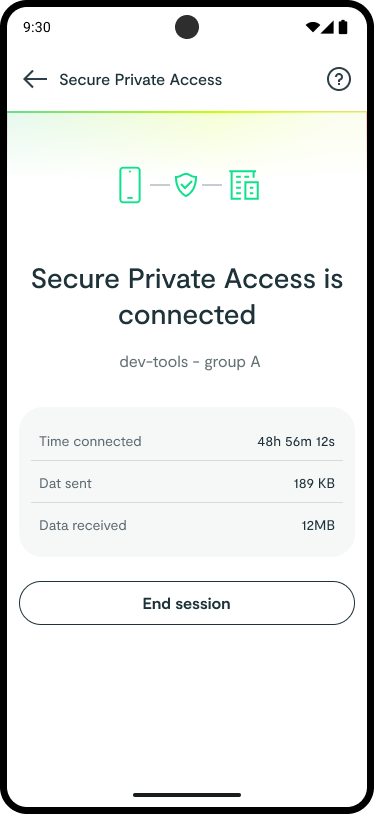
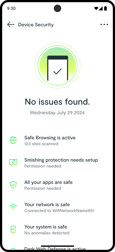
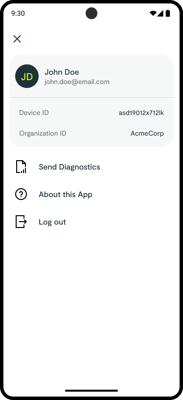
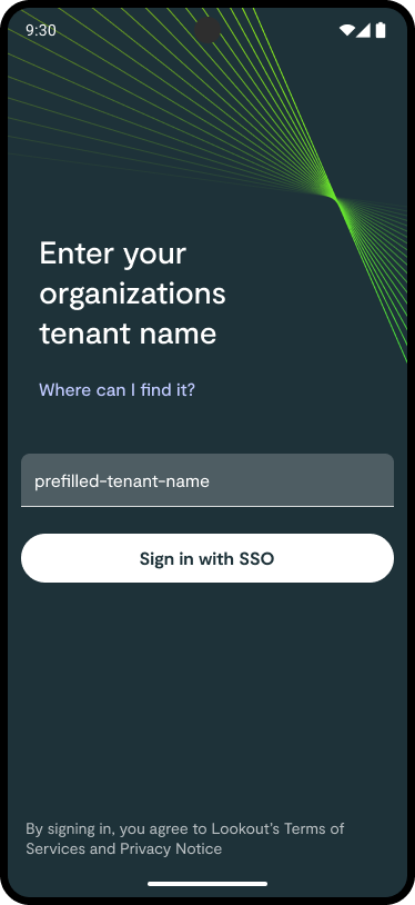
Mobile App Refresh
We applied a major style overhaul, component updates with light UX enhancement focused around accessibility. There were organization changes happening, reducing the clarity of the mobile roadmap. This required us to work closely with PMs so that the designs language rollout would align with their projected feature development.


Design Resource Creation & Management
Figma component libraries for mobile, web console, and desktop clients were created utilizing the established design language. Unique component libraries were needed for product area. This accommodated not only the needed design adjustments per platform, but was tailored to the specific components used by each product area. For example, while the design patterns and fonts might be shared between the two web consoles, the actual components used were different due to the fact that each console was created and maintained by completely separate development teams. This resulted in accurate, realistic, usable Figma component libraries that benefited from the latest variable controls, dev mode annotation and measurement tools.
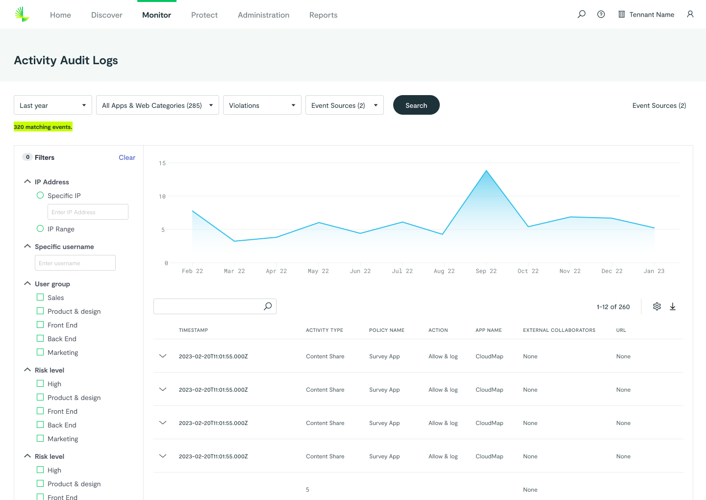
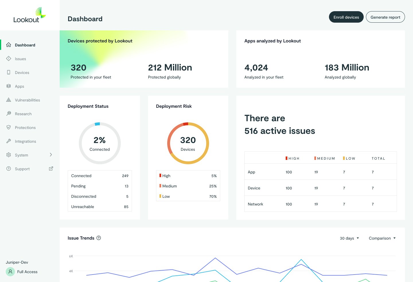
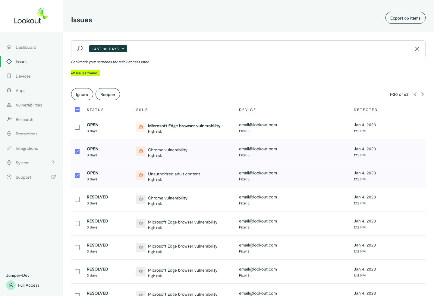
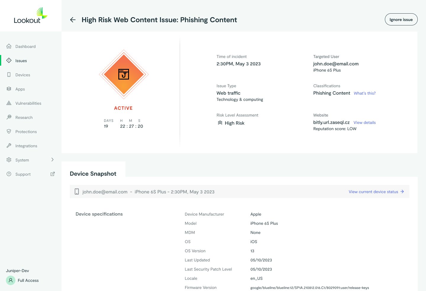
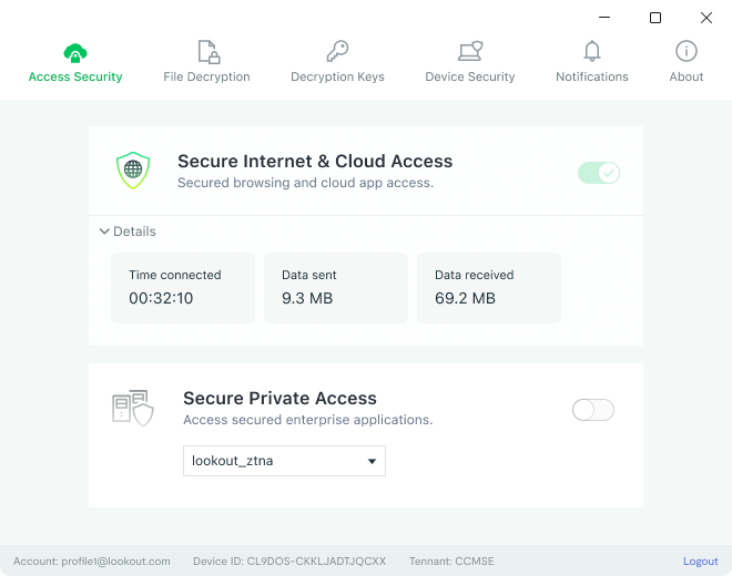
Web console & desktop endpoint refresh
To go along side the mobile app we applied style updates of varying degrees all aligned with the newly defined design language. Each web console had isolated code bases, timelines and resourcing, this required us to work closely with each team to establish a cohesive tailored rollout plan. This allowed us to make progress towards our design vision while controlling pattern continuity.

The result. One cohesive design language across all product areas.
Lookout for Work (iOS, Android), Lookout SSE Console, Lookout MES Console, Lookout Desktop Client (Mac, Win)